SafeParkingLA
This website is a place to learn about Safe Parking LA and the types of services the non-profit organization offers.
The site is targeted toward potential donors, volunteers, government officials, and people living in their vehicles who need to secure overnight parking.
What Makes Safe Parking LA unique?
This website has 2 functions:
Roles & Responsibilities
As an UX Lead I was responsible for:
- Lead interviews of direct stakeholders and domain experts
- Conduct existing website evaluation to identify user pain points
- Lead a customer experience journey session and performed light user research
- Compleyte the user experience design
- Create high fidelity wireframes to show the full website experience
- Complete the visual design
Client
Timeline
1.5 monthes
Problem & Process
Create a responsive website prototype to connect homeless people to SPALA services and attract potential donors.

weeks
from idea to prototype
| Stage | Actions |
|---|---|
| 1. Understand the experience |
|
| 2. Empathizing with Users |
|
| 3. Create key user flows and map informational architecture |
|
| 4. Design a solution prototype |
|
Understanding the experience
Conducted five 30 minute sessions of stakeholder interviews to define the scope of this project.
Before the first interview, I identified five areas that would help me build a strategy for the design process:
- SPALA website business goals (so later we can see where the user goals and the business goals align).
- User goals.
- Technological limitations.
- Project-related information (deadlines, team members, etc.).
- The context and circumstances of how the SPALA website would be used.
Performed in-person and remote usability testing on the existing website to identify site problems and user frustrations.
As a result of usability testing, I focused on two main key goals for this project:
- Redesign and simplify the program’s application questions to speed up the process of intake.
- Improve the Safe Parking LA website experience to make it easier for visitors to find content, cultivate potential collaboration, and attract donors.
Empathizing with Users
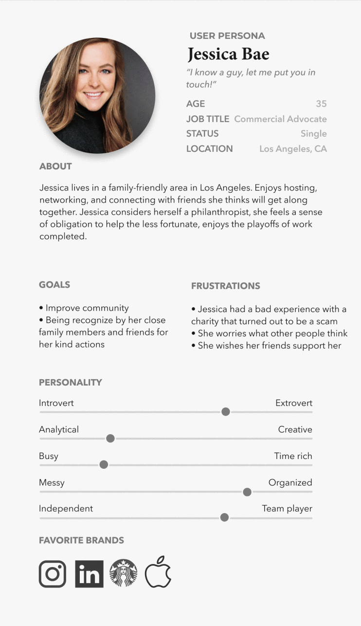
Based on user-testing findings and website analytics, I identified three primary user groups. I created proto-personas to help us stay anchored to the users and avoid letting our desires or design preferences trump user needs.
To gain empathy and a closer understanding of Safe Parking LA site users, I visited SPALA’s overnight parking lot and spoke to the program attendants. The second step was to get in touch with SPALA’s indirect sponsor and learn about their experience interacting with the site.
NEEDS OVERNIGHT PARKING

VETERAN NEEDS OVERNIGHT PARKING

GIVES FINANCIAL SUPPORT
Elise’s Scenario:
Over the past few weeks, Elise and her girlfriend have been fighting. Due to the tension, her girlfriend tells her to move out. Feeling stressed and overwhelmed, she quickly gathers her belongings, gets in her car, and drives off. Because the situation is unexpected, she doesn’t have enough money to afford a motel.
Feeling exhausted from the day, she decides that her best option is to park on the street and sleep in her car.
Bill’s Scenario:
Over the past three months, Bill and his wife have been fighting. Due to the tension, his wife tells him to move out. Frustrated, he gets into his car and drives off. Having a hard time asking for help, Bill blames himself for everything and decides that his best option is to park on the street and sleep in his car.
At 2:00 a.m., Bill is awakened by the police and gets a ticket for sleeping overnight in a restricted area. Bill is on edge and needs help.
PROBLEM STATEMENT:
Visitors who feel lost and desperate need to fill out their application as quickly as possible; they also might not believe that they will receive the aid they need soon enough.
How might we alleviate some stress by providing site visitors with accurate eligibility information and a simple form to complete so that they can find safe parking locations as quickly as possible?
Jessica’s Scenario:
Jessica wants to find a charity that has a solid reputation and provides a valuable service to those in need. She’s against $10,000 per plate charity concerts with celebrities and prefers instead to deal with people who fully believe in the service they provide to society without putting on a show.
Due to a painful experience with scammers in the past, Jessica wants to make sure the money she gives for a cause will be well-spent to help people.
PROBLEM STATEMENT:
Visitors who want to help and give back to society have been scammed in the past and now they’re worried they’ll fall into a scamming trap again.
How might we alleviate some anxiety by providing site visitors with accurate, easy-to-access company information and a simple donation form so they can feel comfortable in their support of SPALA?
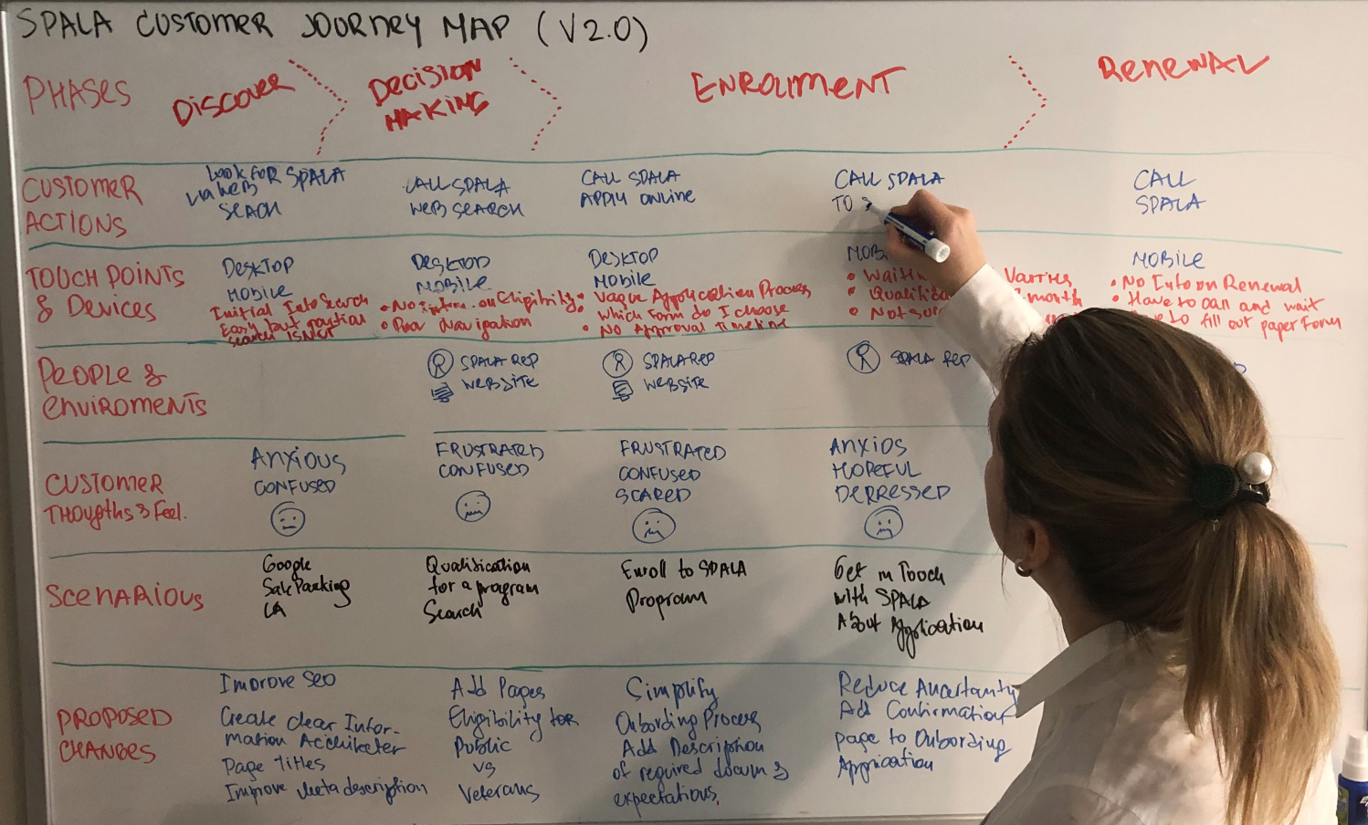
A customer experience journey helped us identify critical moments in the experience of a user visiting the site and completing an application to get into a safe overnight vehicle parking location.
I conducted a customer journey map session to help establish a shared vision with stakeholders and reveal issues early in the product development process.
Redesign Application Forms
I took existing forms and translated them into excel sheets where I can look for duplicated questions and open-ended input text areas to replace with responses selected with radio buttons and/or checkboxes.
During usability testing, users reported confusion about which form was the correct one to fill out. There was not enough information to make the right call. All users reported discomfort typing in data using their mobile devices.
EXCERPT FROM SPALA EXISTING FORMS

WHITEBOARDING PROCESS - GOAL IS TO REPLACE TEXT INPUT FIELDS WITH RADIO OR CHECKBOXES
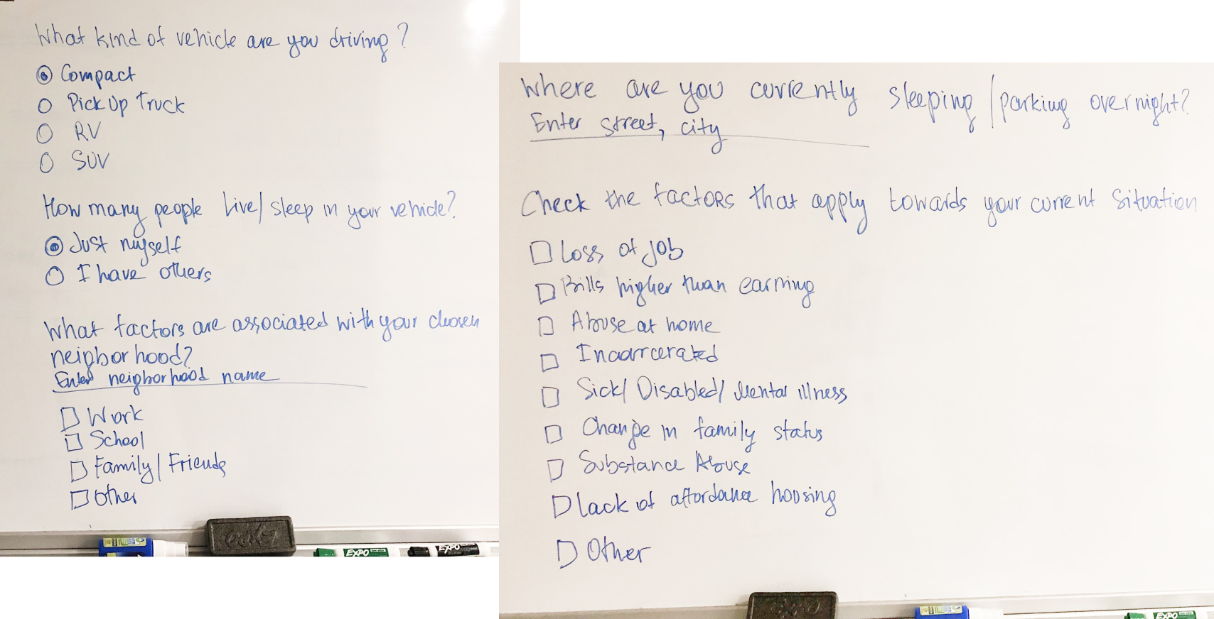
Replacing text input fields with checkboxes or radio buttons cut down the time and stress for users to answer questions and supply the necessary information for the organization to follow up with the interview process.
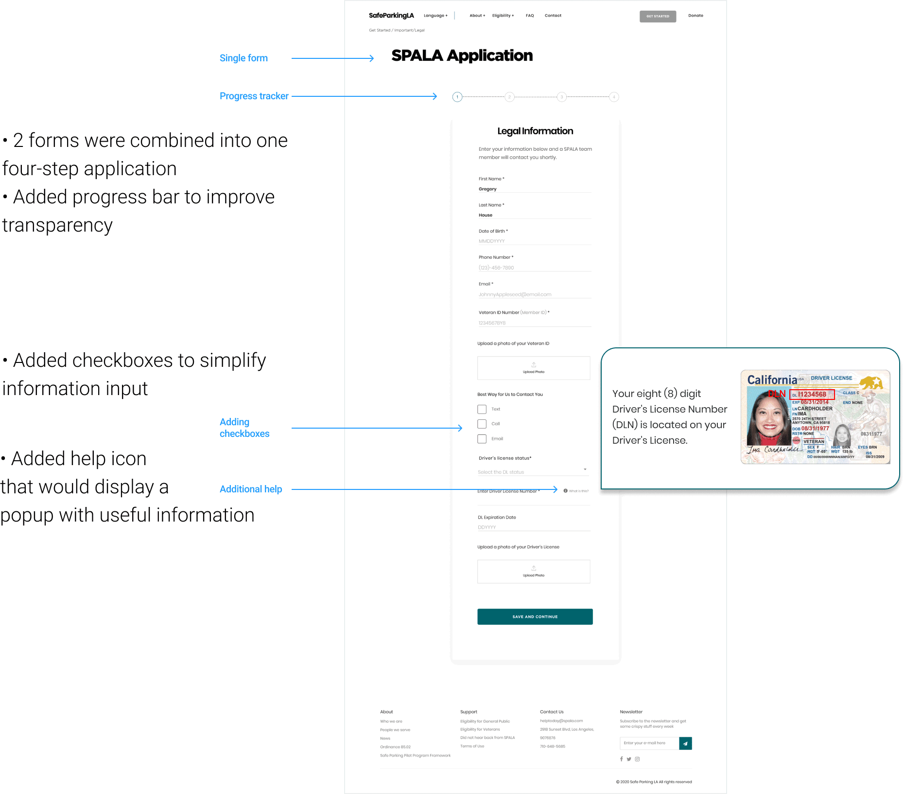
I created a single access point to the application, eliminating confusion as to which should be used, made a clear distinction between two types of users (veteran and non-veteran), and merged two existing forms into a single application.
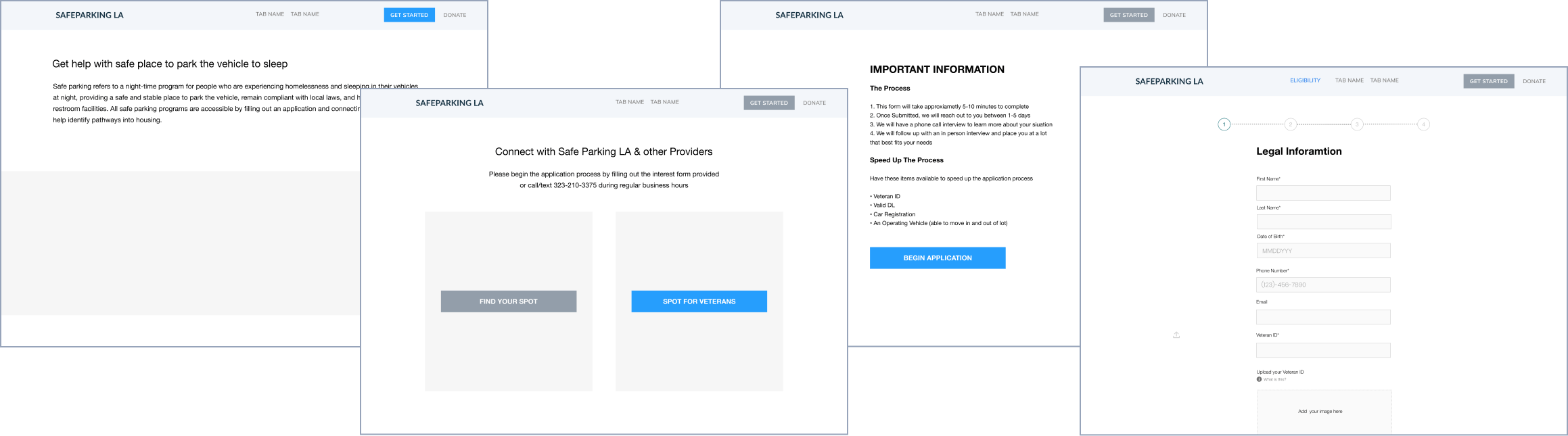
Creating a single point of access eliminated confusion and frustration for users trying to determine which form needed to be submitted first. Furthermore, the complete elimination of one form shortened the time between form submission and the interview process, and optimized user application inquiry at the SPALA backlog database.
EXCERPT OF UI SPECIFICATIONS FOR SAFE PARKING LA APPLICATION
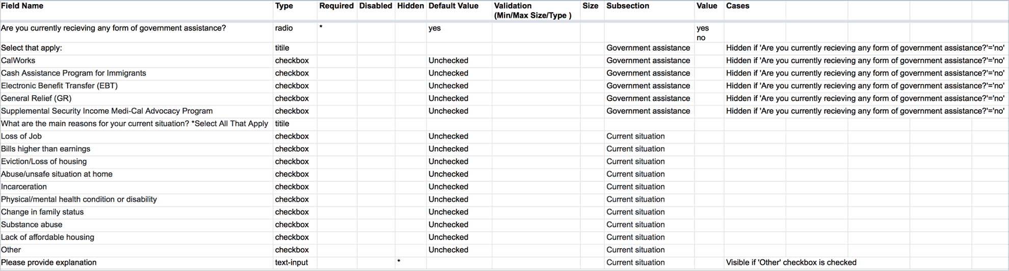
UI specifications were shared with the development team, along with wireframes to eliminate miscommunication and speed up the code development process.
High fidelity prototype screens established a realistic experience to encourage useful stakeholder feedback. After several iterations, I created UI specs using my spreadsheets and shared them with the development team.
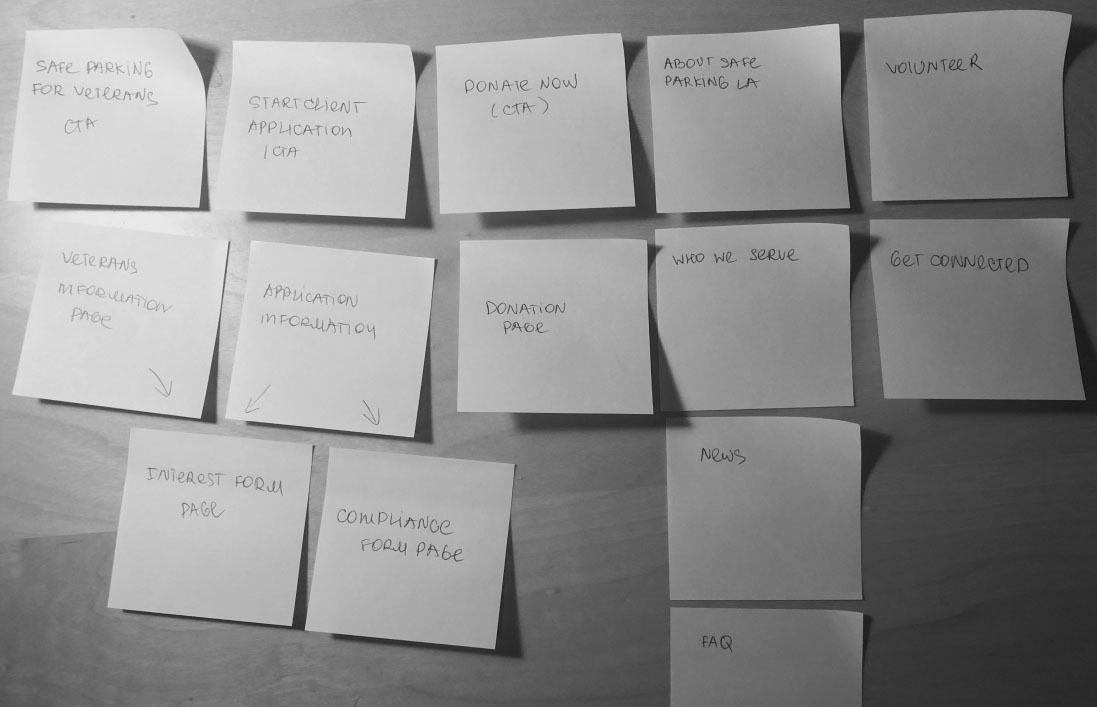
Revisiting Information Architecture
In redesigning the website, I wanted to focus on improving the Safe Parking LA site experience and make it simpler for visitors to find content, cultivate potential collaboration, and attract donors.
During usability testing, users reported difficulty navigating the site and finding information. I used card sorting techniques to improve site navigation, and also incorporated additional content that users reported missing.
PROPOSED SITE ARCHITECTURE

EXISTING SITE ARCHITECTURE
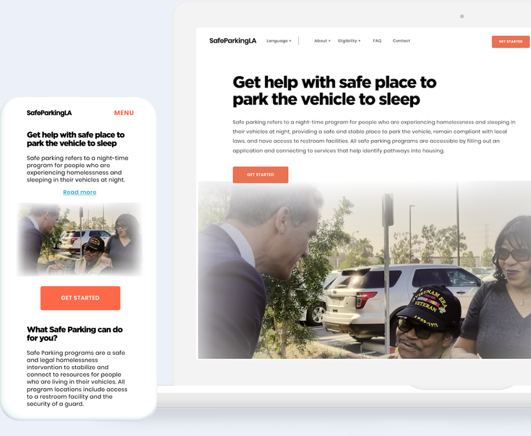
Redesigned Home Page

Results
Our goal for this project was successfully completed. We addressed website pain points such as site navigation, added a key piece of content on eligibility, simplified the onboarding process, and elevated the SPALA brand to current brand expectations. Currently, a Spanish language translation is being integrated, additional content development is in progress, and the site has been developed in HTML, CSS, and JavaScript.
Next Step
Once the website is published, we will continue research to further differentiate the user environment and their circumstances in an effort to improve user profiles and immediate care packages of helpful information to SPALA users. We will also proceed to partial auto-renewal of overnight parking for SPALA users based on compliance criteria to alleviate manual renewal processing through the implementation of the Safe Stay check-in system.