Overview
Registration Management Program (RMP) offers the most comprehensive training in the industry to anyone interested in title and registration rules and compliance. Since its launch in 2010, RMP has trained over 4,000 individuals across California, Illinois, Oregon, and Virginia, with plans to expand.
Roles & Responsibilities
As an UX Lead I was responsible for:
- Perform UX audit to identify problematic areas of the RMP School website
- Create high fidelity wireframes to show the full website experience
Client
Timeline
2 weeks
Problem & Process
RMP School was experiencing some growing pains as a business, with multiple websites offering educational courses, a confusing registration process, overwhelming course selections, stress resulting in a high volume of customer support calls, and negative user experience reviews.
I was assigned to the project and my task was to propose a solution that addressed RMP School website problems in a limited timeframe. To do that, I came up with the following groups of actions:
| Stage | Actions |
|---|---|
| 1. Conducting UX audit |
|
| 2. Working sessions |
|
| 3. Designing a solution prototype |
|
| 4. Presenting changes in operational process to address user registration pain points |
|
UX Audit Findings
In order to gain user perspective and learn more about RMP classes, I interviewed RMP trainers, coordinators, and end user students. A Business Model Canvas session allowed me to evaluate existing business requirements. Furthermore, heuristic evaluation of the website, as well as user testing and analysis of customer support logs with feedback surveys, helped me to identify problematic areas and include findings with the main plan.
Based on interviews with stakeholders, as well as information gathered from the registrant database and customer satisfaction feedback, we identified three major types of users. Each user type had a specific set of tasks they wished to accomplish in a desired time frame based on their context of use. Fifty-two percent of registrants were current Vitu clients who received monthly course proposals with direct links to the registration form.

“I know what I need, make it quick!”

“I don’t know what I need!”

“I am exploring my option.”
Working Sessions
As a first step, I conducted a working session with stakeholders to align myself with them on problems identified during the research phase. Once we agreed on a problems set, we prioritized them according to value for the user and implementation complexity. At a separate session with the product owner, line manager, and development team lead, we limited the scope to fit the projected budget.
MVP iteration scope
| Problem | Solution |
|---|---|
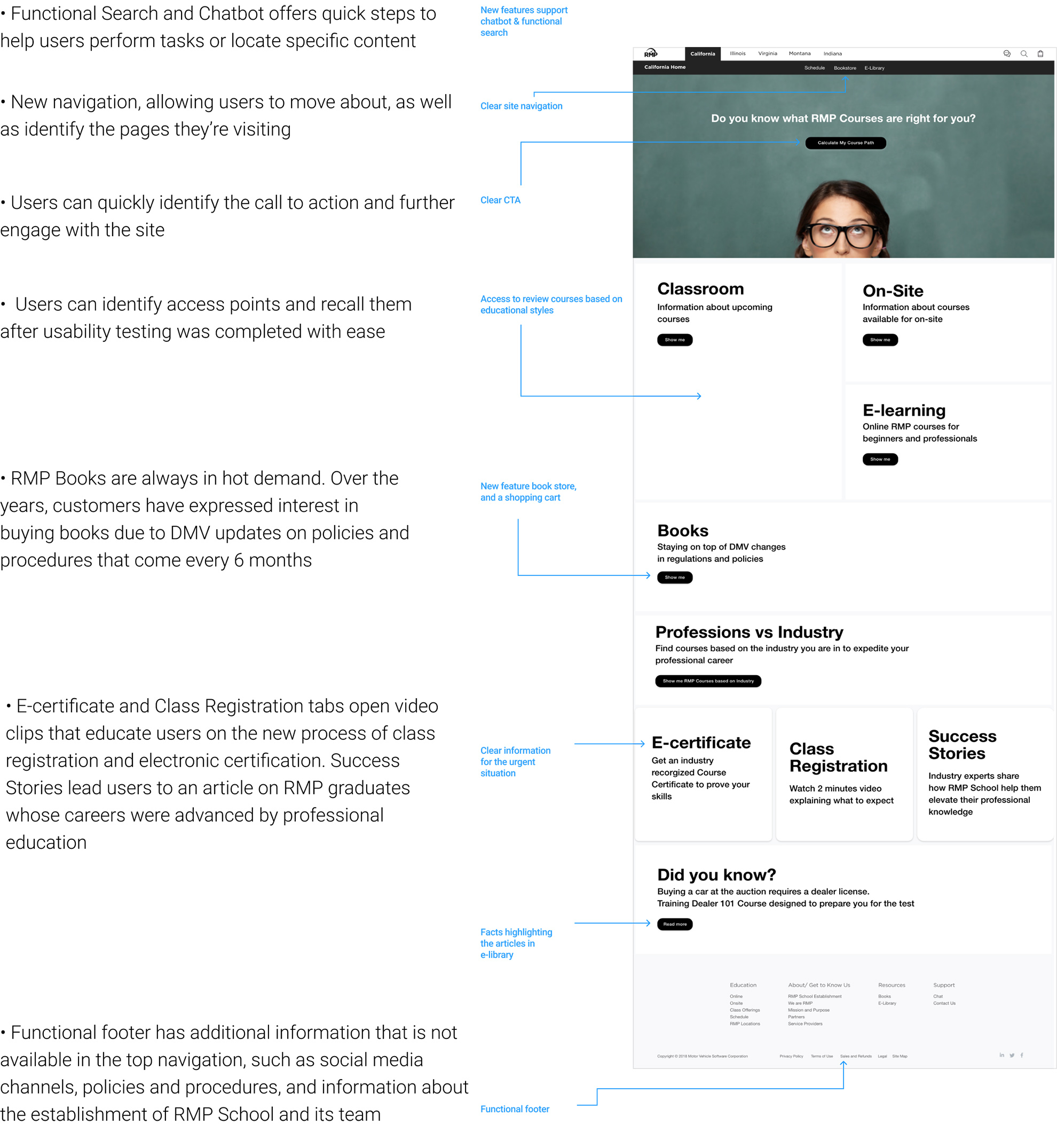
| Users report difficulty navigating the existing website. | Revisit website information architecture. Add clear top and footer navigation bars, a search feature, and chatbot capabilities. |
| Users have difficulty finding courses in their location. | Improve course wayfinding and add location based filters. |
| New users have difficulty identifying which courses are right for them. | Create educational paths based on user professional roles and their type of business. |
| Users overlook the call to action, have difficulty finding links, and are confused with provided information. | Improve affordance of all elements, increase page scannability, and simplify content structure. |
| Users report frustration with recalling information regarding class locations, registration forms, payment methods, and rescheduling. | Propose an alternative for the existing registration process system. |
| Users often misplace or lose certification credentials and have to call the RMP coordinator to ask for a copy to be mailed. | Offer electronic certification to eliminate user pain points and decrease operational time and cost reproducing a physical replacement certificate. |
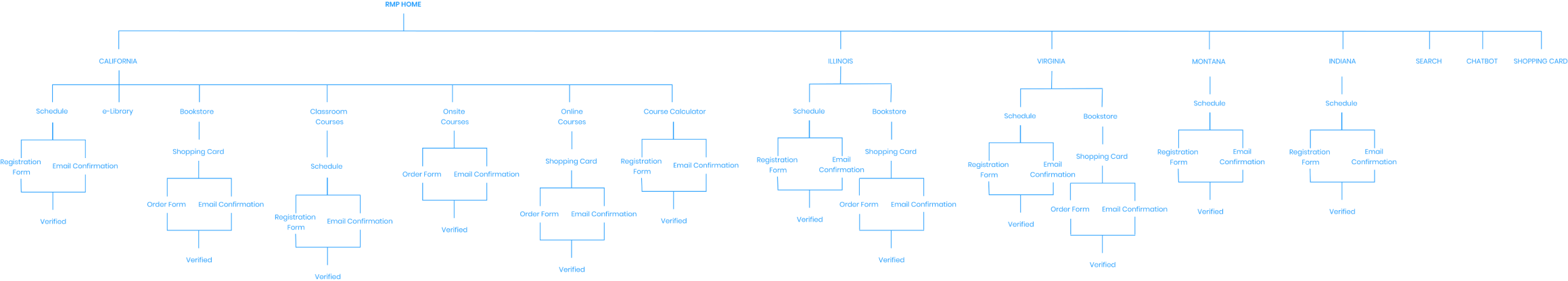
New Information Architecture
After the analysis phase and a working session with direct stakeholders, I developed a new website information architecture for the consumer facing website.
Designing a Solution Prototype
Based on testing with paper prototypes and several cycles of iterations, I created a high fidelity prototype to get additional feedback from direct stakeholders and then run usability testing to identify whether the current page design solved user pain points and allowed them to complete their tasks.
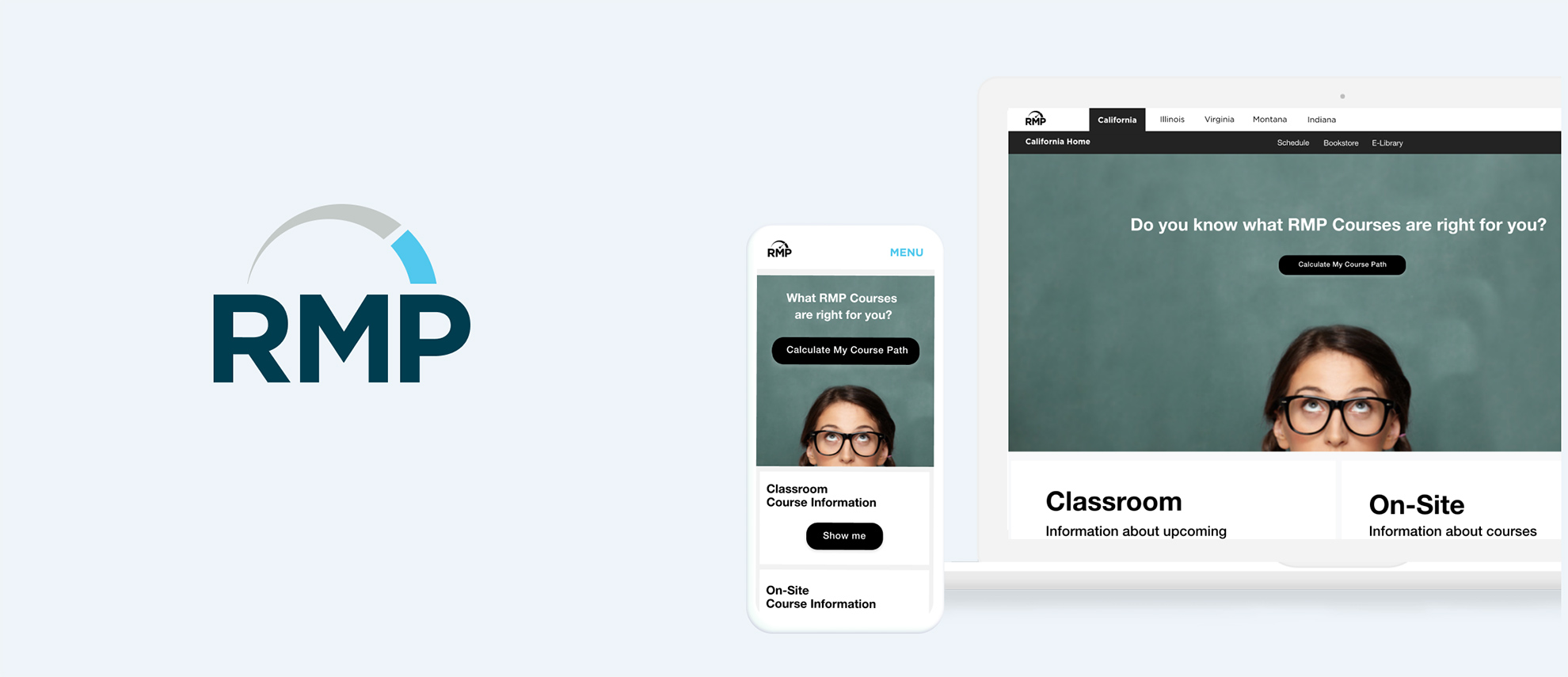
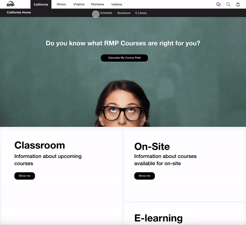
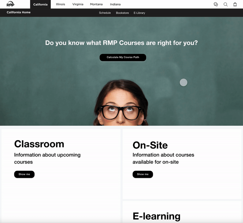
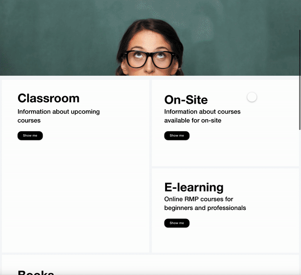
This is a proposed redesign of the homepage for the state of California.
User flow for Classroom Course registration for the state of California.
On average, visitors to the existing website spent 15 minutes looking for a course and an additional 5 minutes completing the registration process. We shortened the time new users spent finding a course to 5-7 minutes, adding additional features that allowed users to sort courses based on location filters.
Step 1. Home page
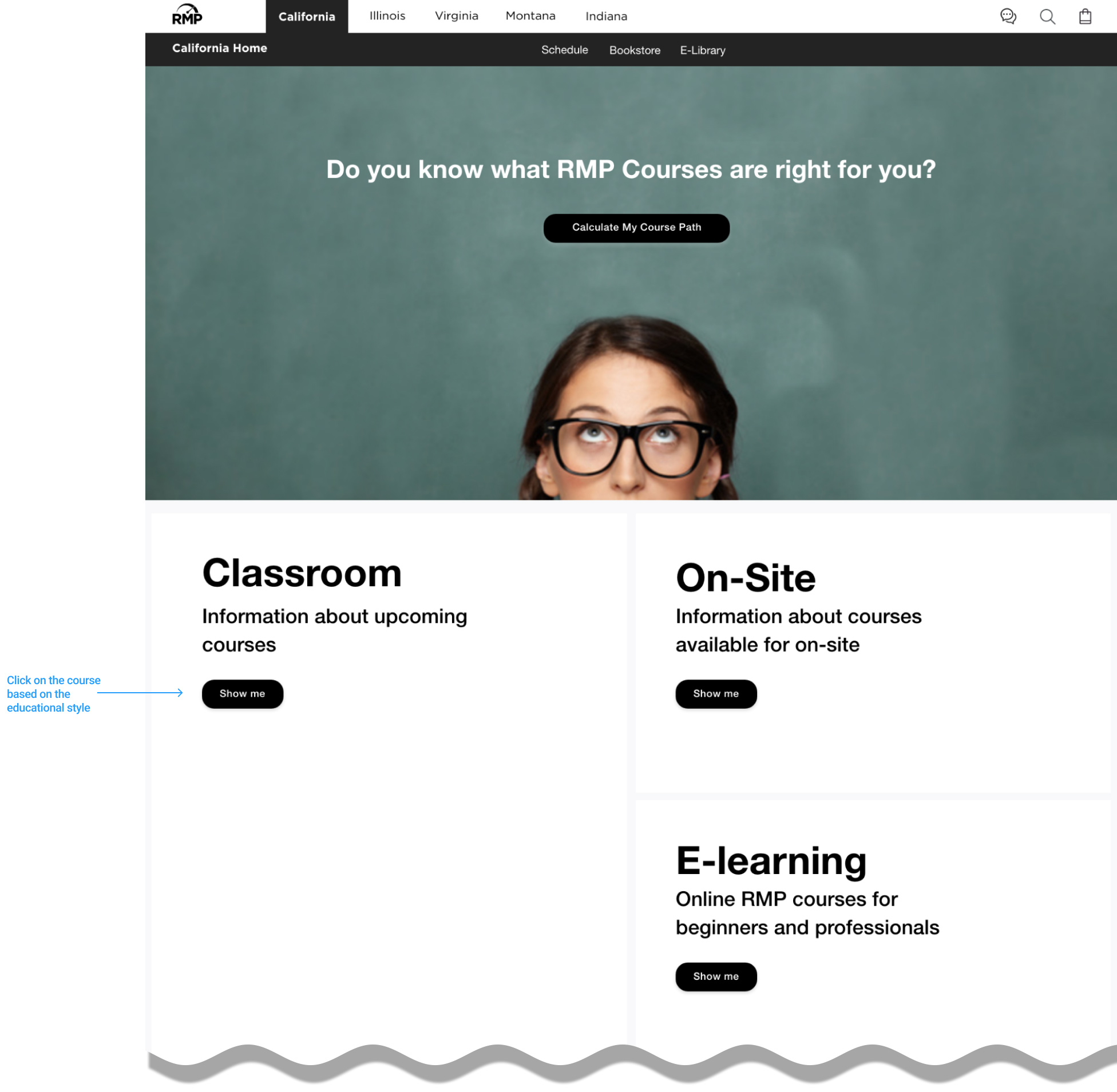
Step 2. Classroom page
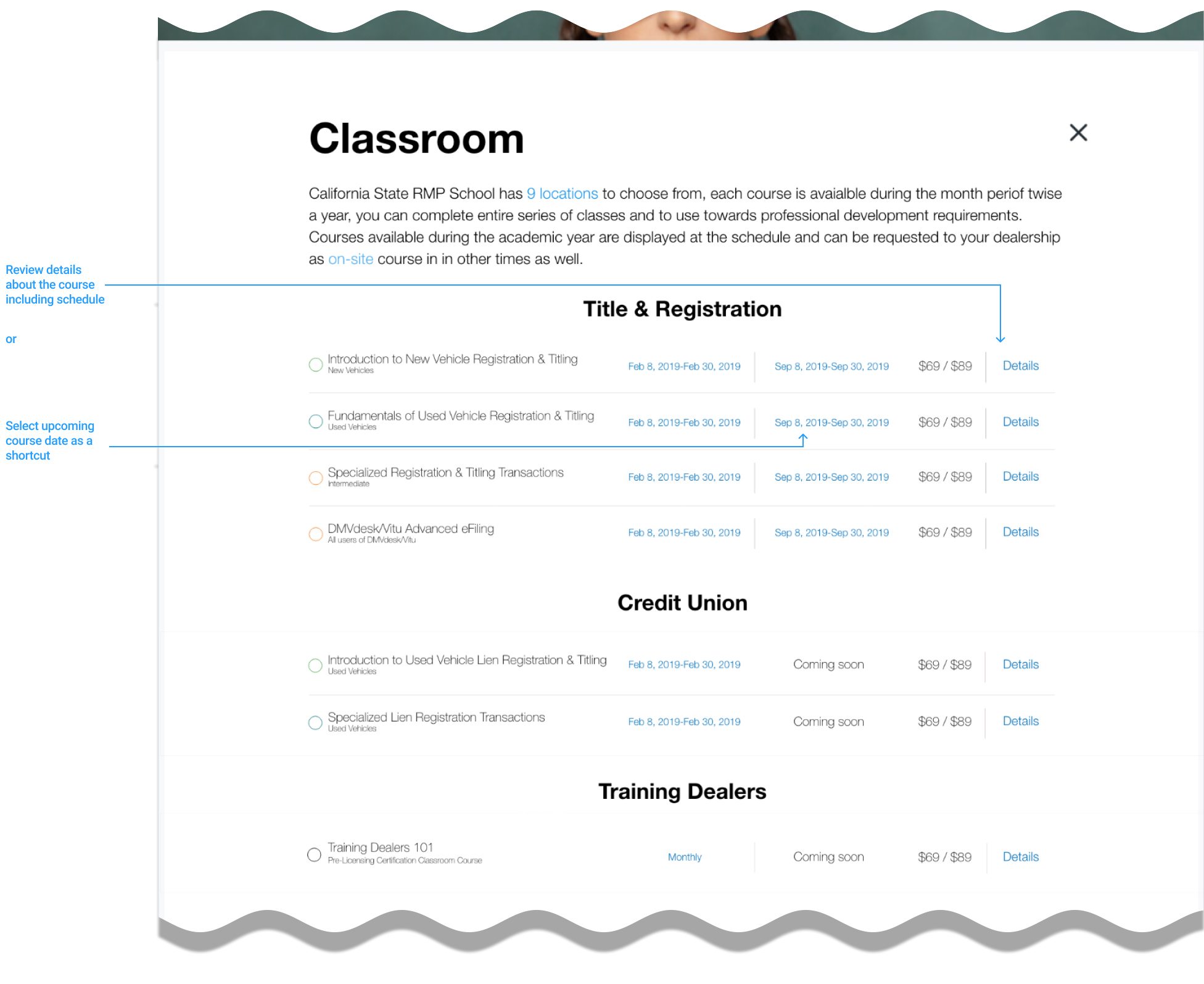
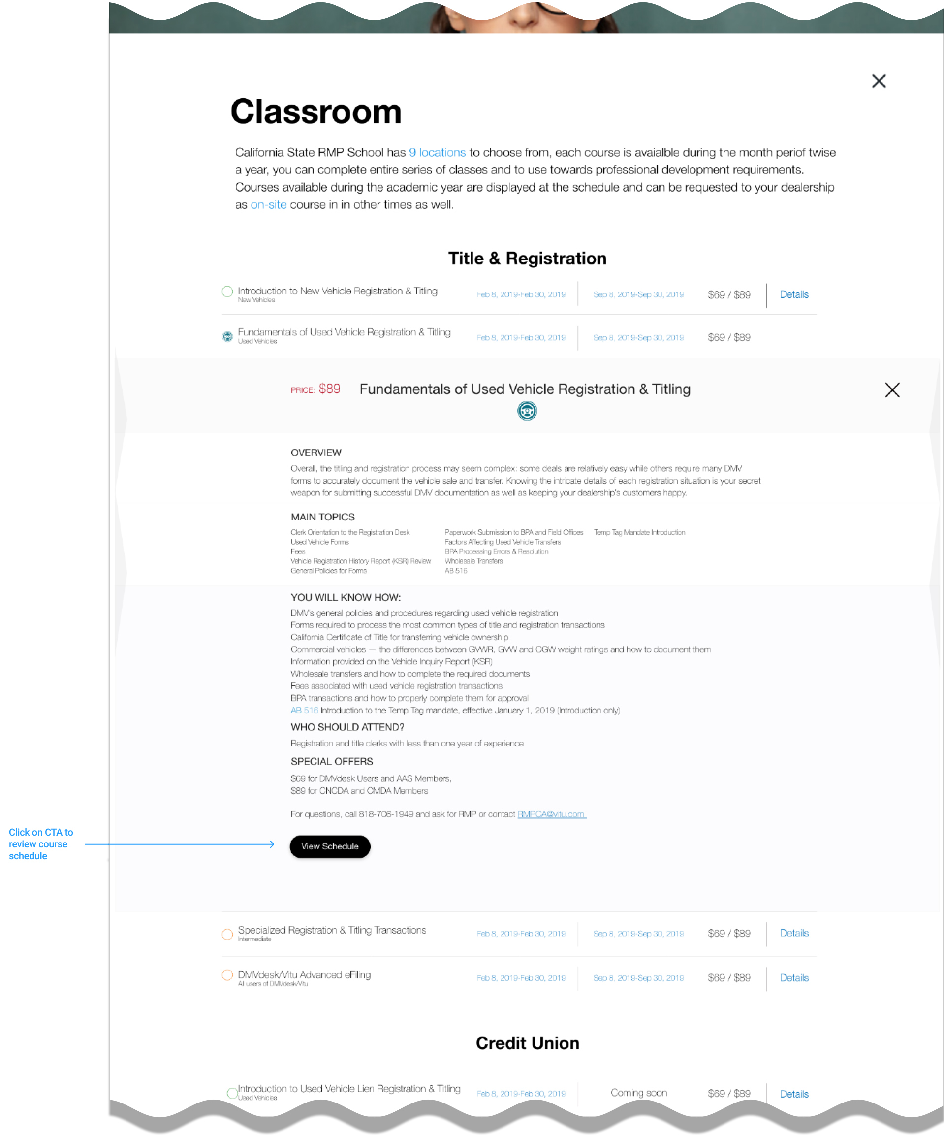
Step 3. Course details
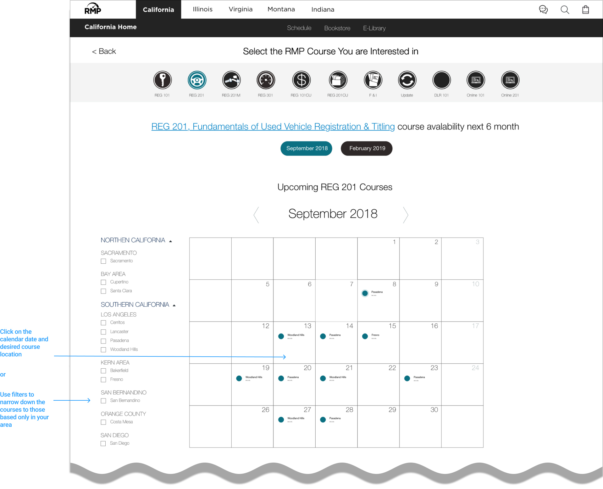
Step 4. Course schedule
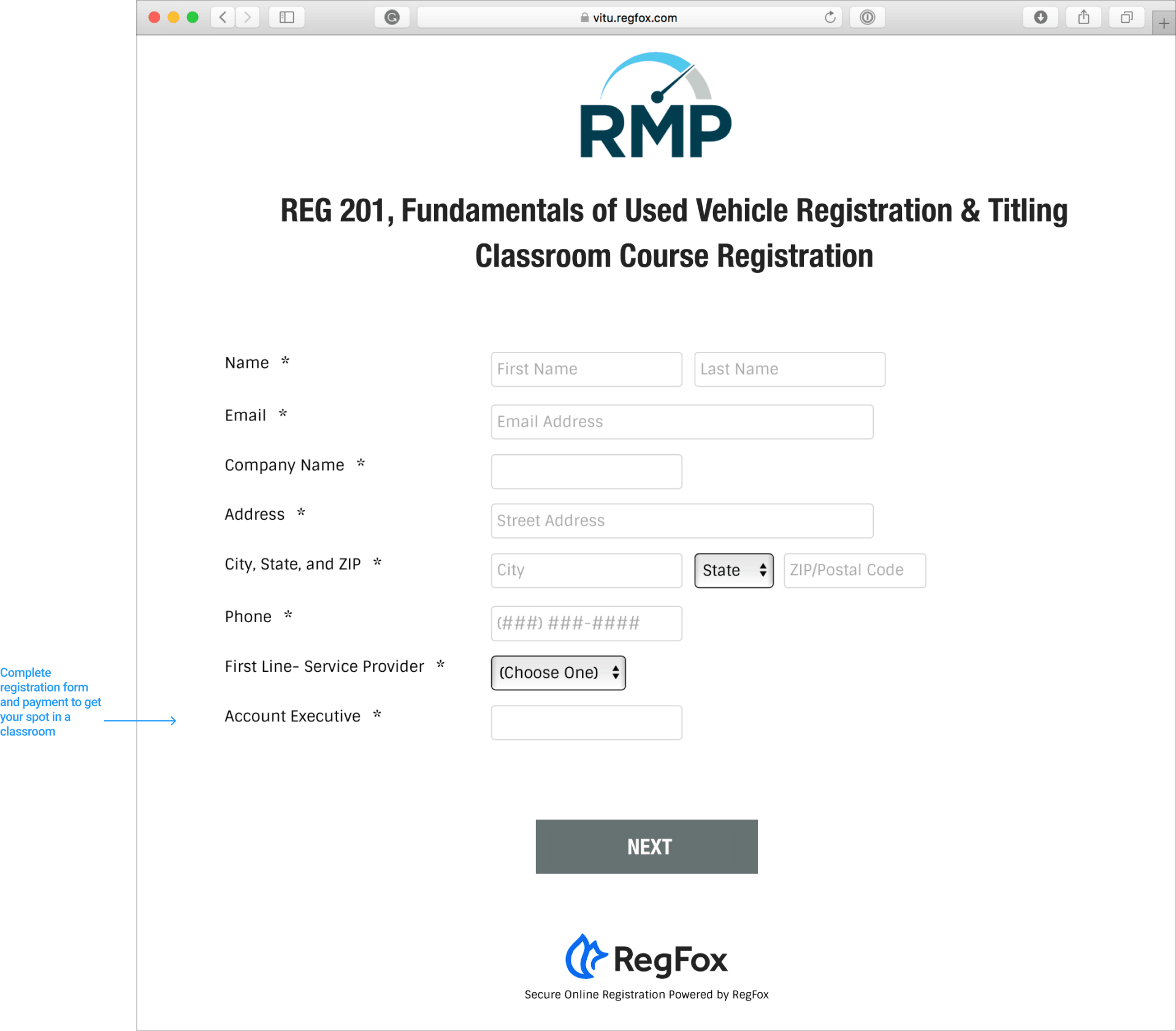
Step 4. Registration form
State specific course schedule
The Schedule tab helps users go to the course calendar directly. Due to industry specific terminology and course abbreviation that was used for more than 5 years, users are trained to identify their courses. By adding clear links and showing only the months of the year that courses are offered, we eliminated user uncertainty and narrowed their search. We also added a filter section to narrow the search based on location, and used links for course detail descriptions. Returning users who were already familiar with the calendar style layout celebrated this improved and simplified express track.
Calculate course path
This feature allows users to select an educational path with a simple interaction page leading to course registration. When this feature was presented to new users during usability testing, users were able to find their courses and identified as feeling delighted and confident in their choices.
Professions vs. Industry Path
Another feature is Professions vs. Industry, an opportunity that allows users to review information related to their professional title courses and leads to course registration and books. This feature was well received by returning users during usability testing, aiding them in finding their courses and allowing continued engagement and exploration beyond their initial task.
Presenting Changes in Operational Process to Address User Registration Pain Points
RMP School used a Constant Contact tool that allowed RMP coordinators to schedule courses and process payments, but it lacked automation around reminders prior to the course, payment reimbursement due to cancellations, and the issuing of electronic certifications.
My goal was to find a solution that could accommodate all user pain points by reducing frustration and decreasing the number of calls to customer support, as well as be budget compatible and well received by stakeholders.
- I researched the market and scheduled demos with several registration services.
- After narrowing my search to a solution called RegFox, I further analyzed its pricing and features to ensure it would solve RMP user and coordinators problems.
- I signed up for the trial period offered by RegFox and created a registration process for the test.
- I integrated a RegFox-compatible electronic certification tool.
- The full registration flow was demoed to direct stakeholders and was well received.

Results and Next Step
After successful task completion, the RMP department received budget approval to move forward with the new website development process.
I assisted the team of developers with business requirements and helped during a weekly meeting to update stakeholders on the site development process.
The RegFox Online Registration System was immediately implemented to the existing website, addressing user pain points regarding the registration process and reducing the number of phone calls to support by 80 percent.
The front-end was developed for mobile and desktop, and delivered to the back-end team.